
Pukka Pies is a market leader and has growing sales figures so why re-brand now?
Brand re-positioning
Think of the Pukka brand and you’ll probably picture dads at the football, eating a cheap pie. The brand’s decision to focus on premium, home life and mums sounds as though the marketing team ate too many pies, got over-excited and decided to set themselves a bonkers challenge of turning their audience on its head. To make it even more interesting, they have introduced new ‘posh’ flavours and will be charging more.

The brand has set out a clear ambition to re-position itself. It wants to convince mums that a Pukka Pie should be a stable of the weekly family menu. With such a change in marketing focus and strong existing brand perceptions the brand needed an overhaul on every front.
With heavy brand investment every aspect of the brand has been tweaked, overhauled or enhanced.
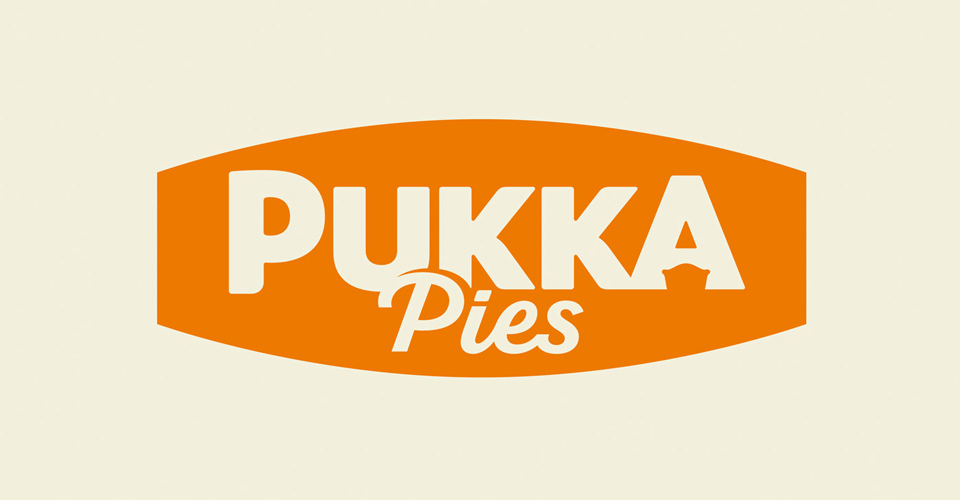
Logo design
The new logo transitions nicely between the old and the new. It looks much better in orange and white and is softer without the black. The introduction of complementary colours enhances the extended colour palette. The typography has been subtly changed by removing the black font and white shadow. The font is now a crisper, cleaner white on orange. We especially like the pie in the A of Pukka.
Brand Storytelling
For a brand focusing on the family market, what could be better than a brand story which speaks of a family built brand which has retained its Leicestershire roots . The brand celebrates its Leicestershire heritage and its work with local charities. It also directly addresses environmental concerns which may surround the brand.
Website
The consumer website follows through the re-brand both in terms of visual design and tone of voice. The design is modern and links to social sharing are prominent. The brand has retained its original fun tone of voice but the language has been softened to reflect the focus on home pie eating with your feet up in front of a tv box-set. Pies photography and family stories are central. Access for Trade is separate and easily identifiable, with all the information you could want at your fingertips.

The Pukka marketing campaign sparks reconition of everyday parenting problems from over excited children with a pair of scissors to awkward moments and unexpected art murals. Their solution, no matter what the kids have been up to answer is a Pukka Pie, with the consistent message that because of them, Everything’s Pukka.
See the re-brand in action here with the Everything’s Pukka tv campaign
What else is new?
The pie makers have introduced Posher Pukka in addition to the main re-brand. These pies are an extension to the brand which focuses on ‘posher’ ingredients. While supermarket own brands grapple to win the low cost pie market and premium pies frequently stray out of the daily pie shopper’s budget, Pukka spotted an opportunity to offer more premium pies at more affordable price. The aim of the Posher Pukka is to offer a distinguishably different taste, but most of all, great value for money. Since the intention is to be less Less-Pukka-like Posher Pukka ingredients include pancetta and leek; and porter ale – well you wouldn’t get that on the football terraces would you?
So, is the new Pukka re-brand a winner?
We love:
- the simplification of the logo
- the hidden pie
- the brand story
Since I’m a mum of two I’m now off to the supermarket to see how Pukka lives up to its new brand promises…
Ready to create a Pukka brand? Give us a call 01279 800 033