
Profitable, growing market share? So why was 2016 the year Mastercard decided to change their logo?
Celebrate your birthday in style
Celebrating it’s 50th birthday in 2016 Mastercard started life in California as Interbank Card Association. The iconic red and yellow interlocking circles we recognise today have represented the brand since it acquired the Master Charge name in 1969. 10 years later Master Charge became Mastercard.
The instantly recognisable brand who the average person thinks of as being a credit card company, that’s predominantly where consumers see the brand after all, actually refers to itself as a technology company. Mastercard processes payments between banks and merchants with its mission being: ‘Every day, everywhere, we use our technology and expertise to make payments safe, simple and smart’.

Mastercard celebrated its 50th year by evolving its brand identity with its first logo change in 20 years. But why? The company is profitable, recognised worldwide and a giant in its industry. Why would it need a new logo?
The company has always aimed to lead in its area and demonstrate innovation and whilst we have all happily accepted its 90s appearance, when you think about it, and look again, did it all feel a bit dated? Does that appearance represent an innovator?
In the company’s press release Raja Rajamannar, chief marketing and communications officer at Mastercard said of the brand evolution: ‘To thrive in this new digital world where business moves faster than ever, we want to modernise and elevate the brand in a design that is simple and elegant, yet unquestionably Mastercard.’

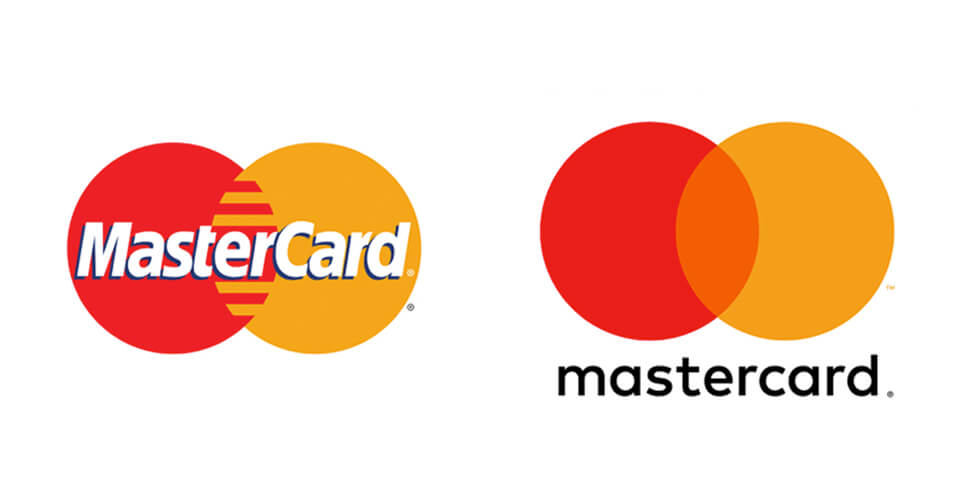
How has the logo evolved?
With this as their aim Mastercard have retained visual continuity of the brand but made the necessary changes to rejuvenate. If you really break down what Mastercard have done, very little has changed and you could go so far as to say it is just a modern twist of the 1968 master charge logo.
The genius of the logo is that the company wants to be seen as continually evolving. The core of the business is money and that it works for and with other businesses, joining, connecting them. What could visually demonstrate that more than overlapping circles? The now removed interlocking lines almost excessively laboured that point.

What has really changed in the logo is the outdated font. Gone is the 90s sans serif font and fussy drop shadow, outlined in the mid 90s for extra emphasis. In, is a modern lowercase font and the removal of the brand name from the circles. Placed below it is easier to read and easier to remove.
The logo now looks fresher and friendlier and, as intended, with the circles and colours remaining, unquestionably Mastercard.
See how the brand unites two of the Design Chambers’ passions, football and languages
Some brands already look brilliant, for everyone else, there’s Design Chambers 01279 800033